Homeworld 3 delayed till May to incorporate player feedback to War Games demo
Seeing game played publicly was "equally thrilling and nerve-wracking", say devs
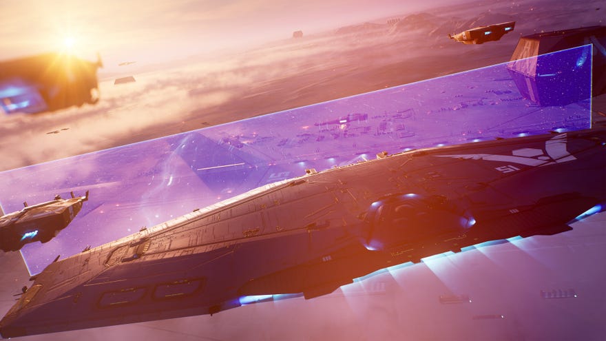
Homeworld 3's release date has been pushed back from March 8th to May 13th 2024, in order to build on player feedback to this week's Steam Next Fest War Games demo, which will be available till February 12th, 10am PT or 6pm GMT. The associated joint statement from developers Blackbird Interactive and publishers Gearbox arrived within hours of me posting about said Homeworld 3 demo and saying that while I am fully onboard with many aspects of the new space strategy game, I do have reservations about its controls.
Naturally, and self-flatteringly, I'm now petrified that I'm single-handedly responsible for the delay. Please come back, Homeworld 3! I didn't mean it! I'm pretty sure I'll acclimatise to the control scheme with practice! True-3D starfleet management is always a bit fiddly! Besides which, I might not get to review it now!! I'm moving flat in May!!!
"Watching you share your experiences, exchange and debate strategies, and give us constant feedback has been incredible," reads the statement. "This was our first time seeing the game played at scale, which is always an equally thrilling and nerve-wracking moment.
"We also recently gathered a dedicated group of players from outside our organizations to play through the full game," it continues. "This resulted in additional insights and perspective that will be incorporated to make Homeworld 3 the best experience possible.
"After careful analysis of feedback, we made the decision to delay the global launch of Homeworld 3 until May 13, with advanced access set for May 10, to ensure that we're making the final tweaks needed to deliver at the level of quality that we strive for and you deserve."
Going by the reaction to the demo from RPS readers, it does sound like there's plenty to tweak, though many of you are enjoying the game. Here's a snippet from Cognac McCarthy, who's played more than I have and thinks the controls aren't really an issue - it's the UI design at large that needs work.
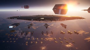
An issue bigger than the controls is the fact that the UI defaults to some less than ideal settings. NLIPS (which makes small units bigger so they're easier to see) is enabled by default, but it makes it harder to tell the difference between your units, and it seems like it may be causing navigation issues for strike craft swarms. And unit type icons (triangles for strike craft, squares for corvettes, etc.) are set to disappear when the camera gets close, I suppose to reduce the visual noise, but in reality it just adds a barrier to reading the battlefield. Icons should be displayed at all times to give you an idea of what type of units are coming at you and what units you have nearby. Thankfully both of these settings can be easily switched, but I suspect a lot of people are going to bounce off the demo harder than they should if they feel like they can't read situations quickly and easily.
And here's Dave L, with thoughts on the fussy business of hiding your ships behind asteroids.
There are also some gameplay issues. The biggest one probably being strike craft formation behaviour. After everybody was furious with Homeworld: Remastered for messing this up, I'm baffled by how they've made essentially the same mistake here. Ship pathing is also weird, especially when close to the 'terrain.'
I think throwing players straight into dealing with megaliths and stuff was a bit of a mistake. It's a pretty big departure from classic Homeworld, and experienced players of ground-based RTSes are going to have a hard time dealing with the 3D camera and movement controls already. Starting with some wide open space maps and gradually introducing the structures would work better.
Delays notwithstanding, Homeworld 3 remains one of our most anticipated games of 2024.


